Passion Squared Facebook Cover Photo

Awesome Facebook Image Cheat Sheet

“You can’t have style if you don’t have substance.”

Ozwald Boateng
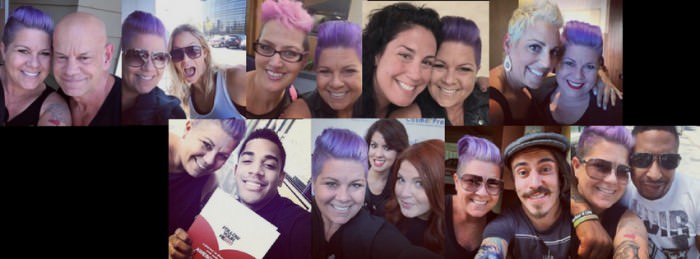
 

Passion Squared Facebook Cover Photo Love these beautiful humans so much: (pictured from left to right)
Winn Claybaugh Ashley Conrad, Aura May, Brenda Bilodeau Amaral, Keri Davis, Brenton Lee, The Hair Nerds, Sugar Skulls, DC The Barber

Oh Facebook, why you gotta keep changing? While many get frustrated with all the changes over at Facebook, one of my jobs is to help you keep up with the biggest changes, the ones that may have the most impact on your biz and brand. With the new Biz page re-design, a few things have changed when it comes to image sizing.

The picture above is just a snapshot of some of the beautiful humans I have had the opportunity to hang out with recently, so I created a collage (with my fave new tool Canva) for the Passion Squared Cover image. As you can see, I left the far left side blank, that’s where the profile pic goes. A minor detail, but in my opinion, a major detail when it comes to how we present our brand.

Cut off logos, cut off words, blurry images are all big NO-NO’s if you want to present a professional and powerful image to your community.

Here are the new sizes for Facebook images.

Cover Image
Facebook Cover with Profile
Event Image
Facebook Event Image


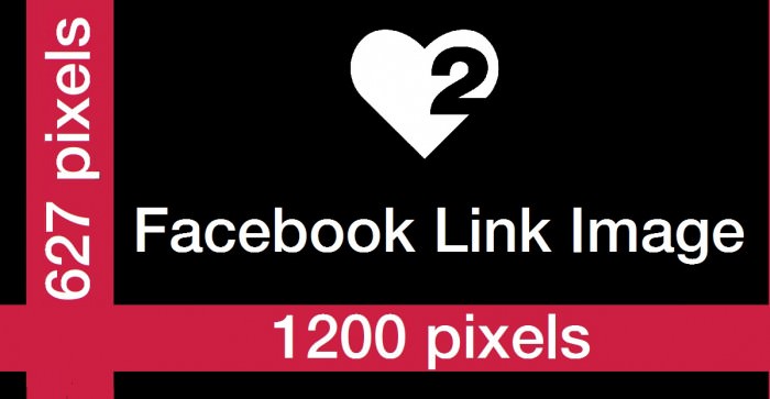
Link Image
(this is when you are posting a link on Facebook)
Facebook Link Image


Tab Image

Facebook Tab Image

Post Images are still SQUARES. The best size is 400X400 and larger. My daily quote posts on Passion Squared are 800X800, the largest recommended is 1200X1200.

As always, I highly encourage you to work with a designer to create graphics and templates that you can use to create your Facebook content. As I have shared in my post 4 Awesome Content Creation Tools a few weeks ago….. I love PicMonkey and Canva to create content.

No matter what you do today, or this week, please take a look at your current Profile image on your biz page (it needs to be your logo sized properly) and your Cover Image. Are they as awesome as they could be? You have all the tools you need to create awesome images, so now it’s just a matter of deciding how important it is to you. HINT: If you are trying to grow your biz and attract new clients, your brand image needs to be important to you.

Love + Awesomeness-
Nina

PS: This post does not currently have audio due to some major tech issues, I will add audio when I can sort everything out. Hello Monday!

Instagram Logo

Connecting Instagram to Facebook Step by Step

“The more that you read, the more things you will know. The more that you learn, the more places you’ll go.”

Dr. Seuss

Instagram Logo

Here is the audio version of this post. Thank you so much for listening.

One of the most common questions I get asked about Instagram is about how to share your beautiful images to your Facebook biz page.  The question came up again on a recent webinar along with a request for a step by step. So a BIG shout out to Brenda and Dawnette for inspiring this post.

Here we go….

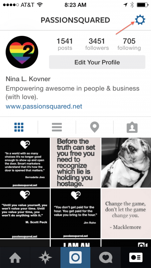
Step One
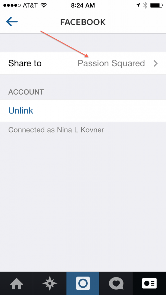
Log in to Instagram, go to your profile page and click on the little wheel thing in the upper right hand side of the page.

Instagram step by step one

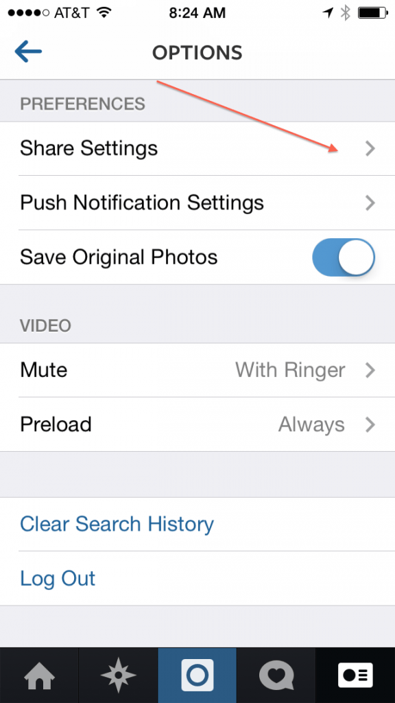
Step Two
Click on Share Settings

Instagram step by step two
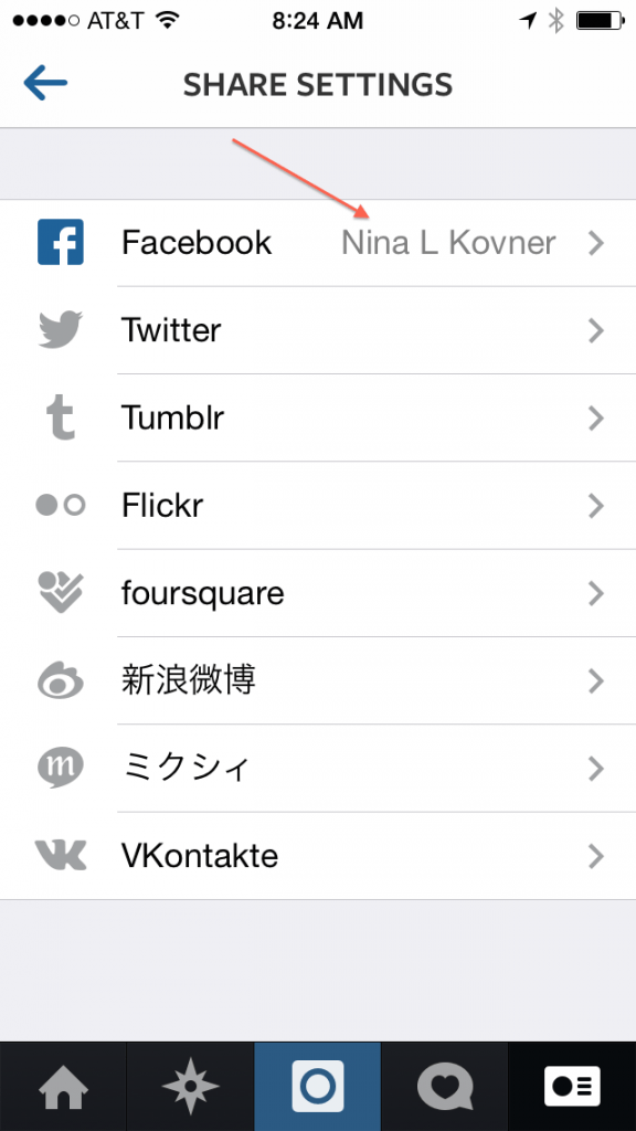
Step Three

Click on your name. It should show the name of your Personal Page that is connected to your Business Page. If you have not yet connected your Instagram to your Facebook personal page, it will ask you if you want to connect, etc. Do that. Then click on your name.
Instagram step by step three

Step Four
If you manage one business page, that page name will appear and you simply select that page. If you manage more than one business page, select the business you want to SHARE your Instagrams to.
Instagram step by step four
Step Five
Start sharing your awesomeness!

Thank you again to Brenda and Dawnette for inspiring this post. Are you sharing your awesomeness on Instagram? Let’s connect! You can follow me @passionsquared

Love + Awesomeness-
Nina

Goodies from Gary Vee

Great marketing is all about telling your story in such a way that it compels people to buy what you are selling.  -Gary Vaynerchuk


Here is the audio version of this post. Thanks so much for listening. Enjoy.

Gary Vaynerchuk knows things and even better, he shares things. He recently shared some insanely awesome infographics which simply break down some key facts about the social platforms we love, and our clients love. What I love about these is that they focus on awesome content examples that fit the context of the platform, which is key to true engagement, inspired by his latest and awesome book Jab Jab Jab Right Hook.

In this latest book, he uses the example of boxing where the jabs are the set up, the value we create by posting relevant and interesting content, and the right hook being the big punch, or asking for the sale. I love him and his brain. Consider this. Are you posting all jabs and no right hooks? Or all right hooks and no jabs? The sweet spot is more jabs than right hooks. Think about it.

Check out these super awesome infographics Gary created to help us share our story with the right content in the right context for the platform to provide value, build relationships, engage and ultimately make a sale. Brilliant.


Facebook Facebook Infographic from Gary Vee


Instagram

Instagram Infographic from Gary Vee

Twitter Twitter Infographic from Gary Vee

So now its time to look at your content strategy. Are you jabbing on the right platforms? Right hooks? Storytelling? Is it time to re-think it? I want to know. Share your comments below or click here to share your thoughts with me. I’m listening and I care.

(shared with LOVE from Nina)

Facebook Profile Image

Awesome Cheat Sheet for Social Platforms

“Of all of our inventions for mass communication, pictures still speak the most universally understood language.”

Walt Disney Company


A Picture Is Worth A Thousand WordsHere is the audio version of this post. Thank you so much for listening. Enjoy.
As the year comes to a close, I reflect on all the opportunities there are for small businesses when it comes to branding, storytelling, and marketing both online and off. One of the biggest areas I continue to see is how we present our images on social platforms.

Image matters. Both online and off. Cut off logos, blurry pictures, cut off pictures, etc are not helping our image. But there is a solution. Finding a designer that can help size your images can make a big difference in how your brand is seen in the eyes of the customer.

While there are always exceptions and variables and the platforms seem to be changing almost by the day, these templates are a great place to start.

Facebook Profile Art (and almost every other social platform profile pic)
If you are using Facebook for business, your logo goes here. Not a promotion or fancy image. Save that for the Cover Image or a post.
Facebook Profile Image

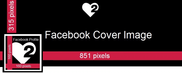
Facebook Cover Art
This is an awesome place to show your business, your work, a feature program or promotion. Make the space count and change it up just like you change-up your marketing calendar. When creating this image, be sure to leave space for the Profile pic in the lower left hand side. Facebook Cover Art template

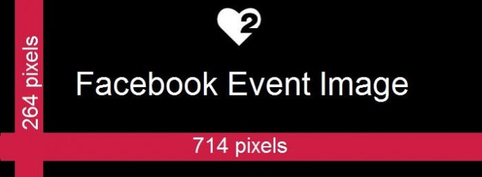
Facebook Event Art
If you are big on posting events such as fundraisers, girls nights, grand openings, etc, this can be a highly engaging part of your Facebook biz page.
Facebook Event image template

Facebook Post Art (also Instagram)
When creating art for Facebook and Instagram posts, this is a good template to follow. When you post images taken from your phone or tablet, Facebook and Instagram almost always “re-size” it for you when uploading.
Facebook and Instagram post template

YouTube Channel Art
If you have not noticed, YouTube changed their channel layout, and thus, the need for creating new art. It’s a tricky one, but important none the less if you have a presence on YouTube.

YouTube Channel Art template

Pinterest Pin Art
Image is everything on Pinterest. Be sure to invest the time, money and energy to present compelling and powerful images if Pinterest is part of your social strategy.Pinterest image template


When in doubt, always go to the HELP section of any social platform. There is almost always help available on sizing, dimensions, etc. Are there any platforms you would like to see a cheat sheet for? Share your thoughts in the comments below or reach out directly to me, I’m listening.

As 2013 comes to a close and plans are being made for 2014, it may be a good idea to add a review of all your social pages. Do they reflect your image, message and brand? Are all the links updated and working? Is your About section current and relevant. Those are just some of the questions to ask yourself as you do your year end review.

(shared with LOVE from Nina)

The Customer Experience (online)

“We see our customers as invited guests to a party, and we are the hosts. It’s our job every day to make every important aspect of the customer experience a little bit better.”

Jeff Bezos, CEO Amazon.com


Are You Discoverable
Here is the audio version of this post. Thanks so much for listening. Enjoy.

Today is Cyber Monday, another made up shopping holiday to drive traffic to websites to consume goods and services. I’m sure you know this by the gazillion emails that are waiting for you to click on in your inbox. That fact is, we are all online. Whether we are socially networking on Facebook and Instagram or shopping for the holidays.

We are all in e-commerce today, one way or another. And we all need to think hard about the customer experience (online), if we want to be a relevant business in 2014 that is.

Here is a simple checklist for you to see if you are a discoverable business and for you to audit the customer experience (online).

Google

Search Engines
1. Google terms that relate to your business. If you are a hair salon, Google “best hair salons”, “best colorist”.
2. Take a look at what results come up. Are you there?
3. Click on the links. Are they your business pages? What do they look and feel like?

Website

Website
1. Visit your website.
2. Is it easy to find your location? Contact info? Hours of operation?
3. Are there pictures of your business and your work?
4. Can I make a reservation or at least contact you?
5. Is the copy reader friendly and relevant to your business?
6. Can I easily see where to find you on Facebook, YELP, etc?
7. Is it mobile friendly?

YELP


YELP (being active on YELP is one of the best ways to rank higher in search engines. Fact.)
1. Have you claimed your page? If not, click here to learn how.
2. Have you added images of your business and work?
3. Have you filled in the “About this business” section?
4. Are there recent reviews?

Google Places

 Google Places
1. Have you claimed your business?
2. Have you added images, contact info, hours of operation and a business description?

Facebook

Facebook
1. Do you have a business page?
2. Have you claimed your unique URL? This is the best way to show up in Graph Search, the “Google” of Facebook. Click here to learn how to claim your name.
3. Is your about us section filled out?
4. Are the hours of operation there?
5. Is your website, phone number and an email address available?

Instagram

Instagram
1. Have you written a short about message?
2. Is there a link to your website?
3. Do you have your phone number or email listed?

Inbox

Inbox
1. Can I easily find where to sign up for your emails?
2. Do you have a subscribe area on your website?
3. Do you have a subscribe tab on your Facebook page?

While this is not even close to a complete list, it’s an awesome start if you are in a service business. When was the last time you took a look at your online presence? Today may be an awesome day to start.

(shared with LOVE from Nina)